J.R. LIGGETT’S BODY BARS

J.R. Liggett’s Body Bar Collection
Design Challenge
Redesign the packaging and branding for J.R. Liggett’s new product line of natural shampoo bars. The design must reflect the brand’s commitment to sustainability, minimalism, and high-quality ingredients, while also appealing to modern consumers. The packaging should balance eco-consciousness with functionality and create a seamless user experience.
Design Narrative
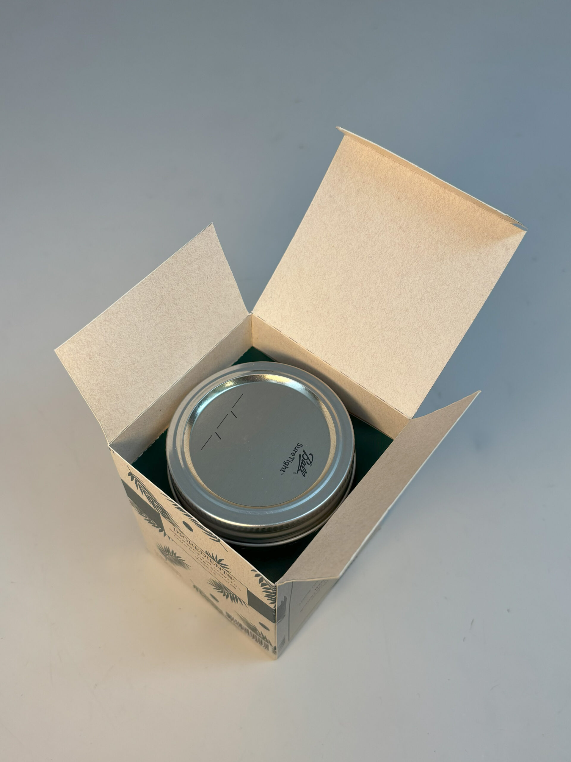
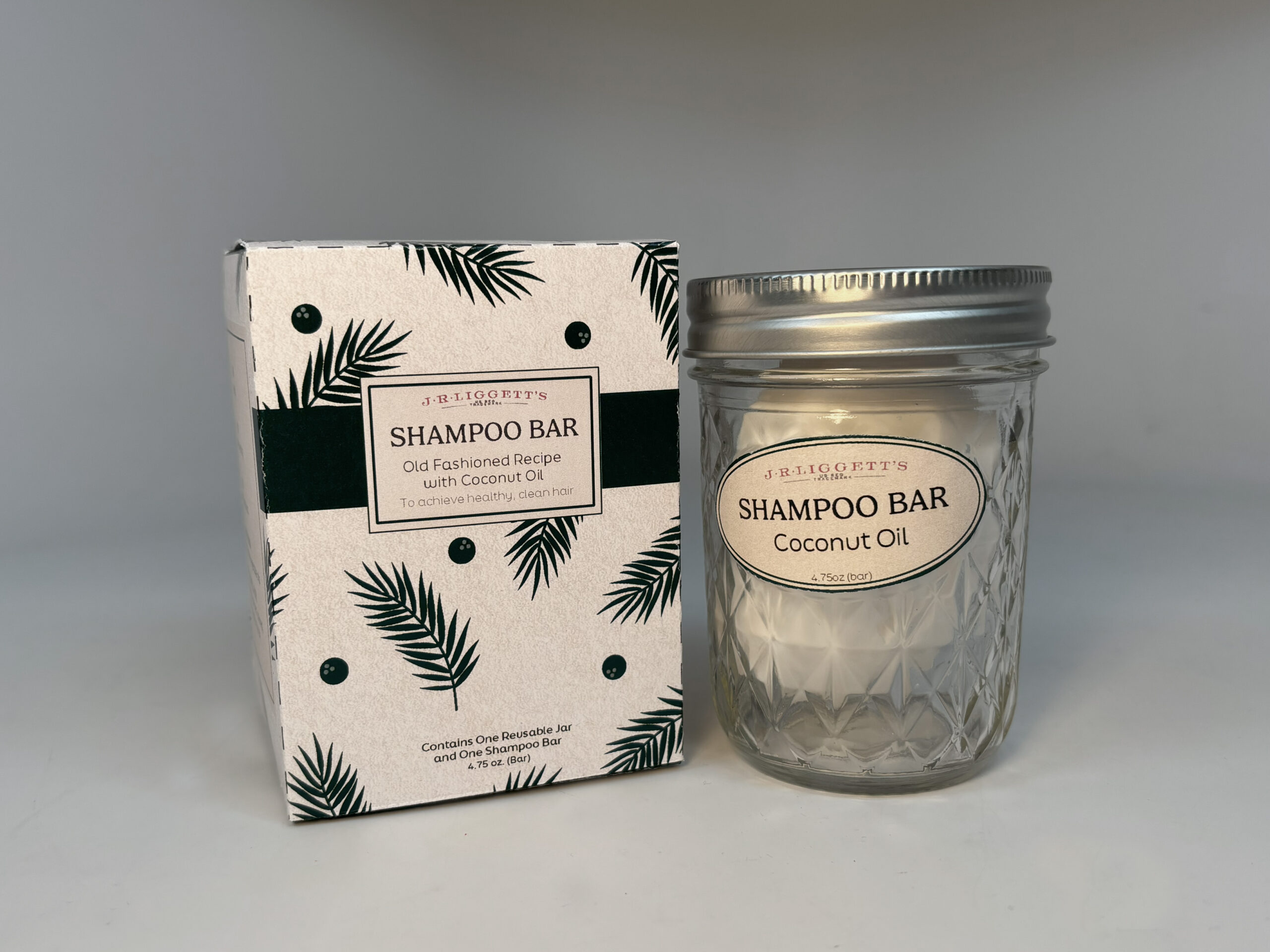
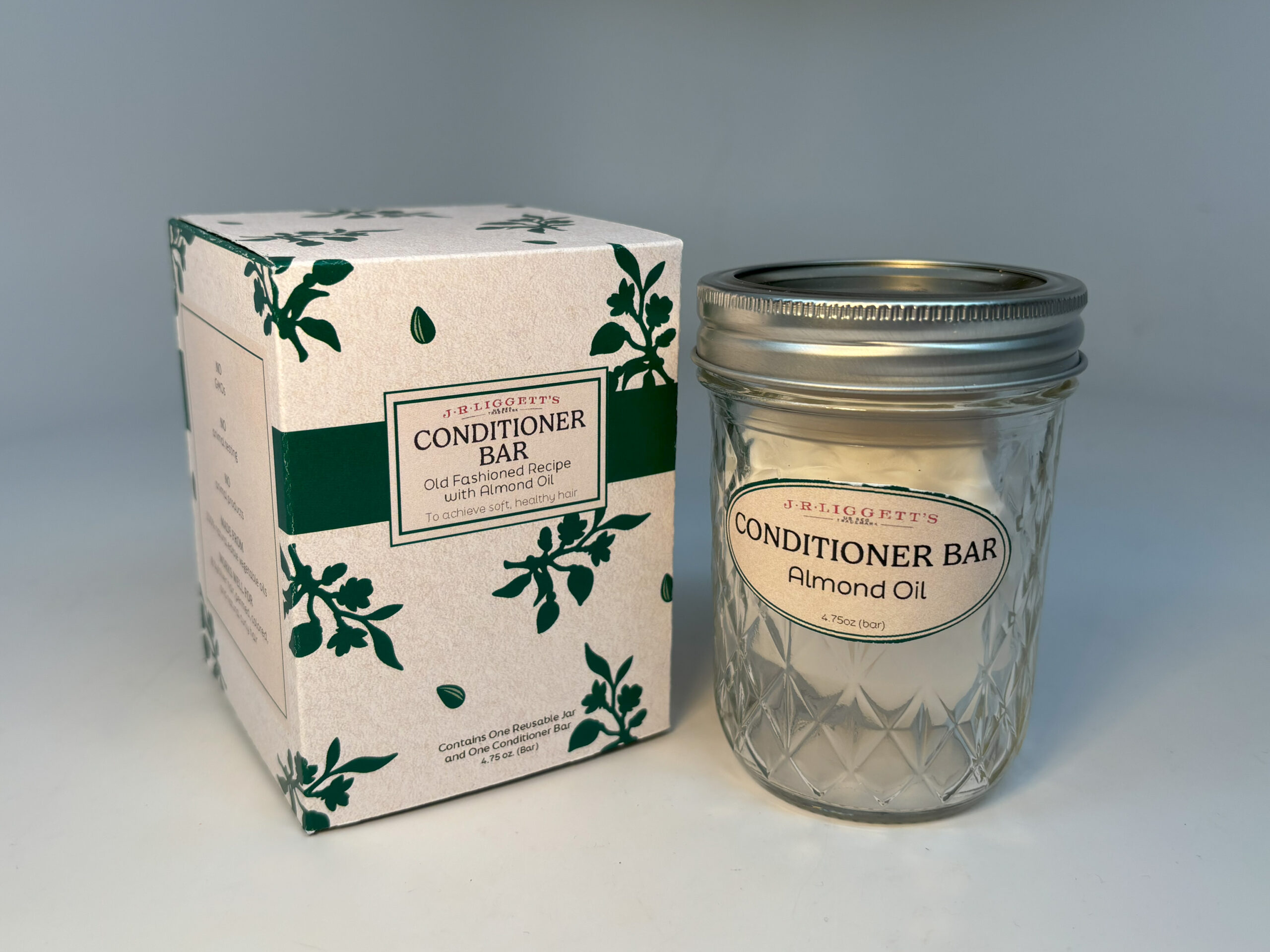
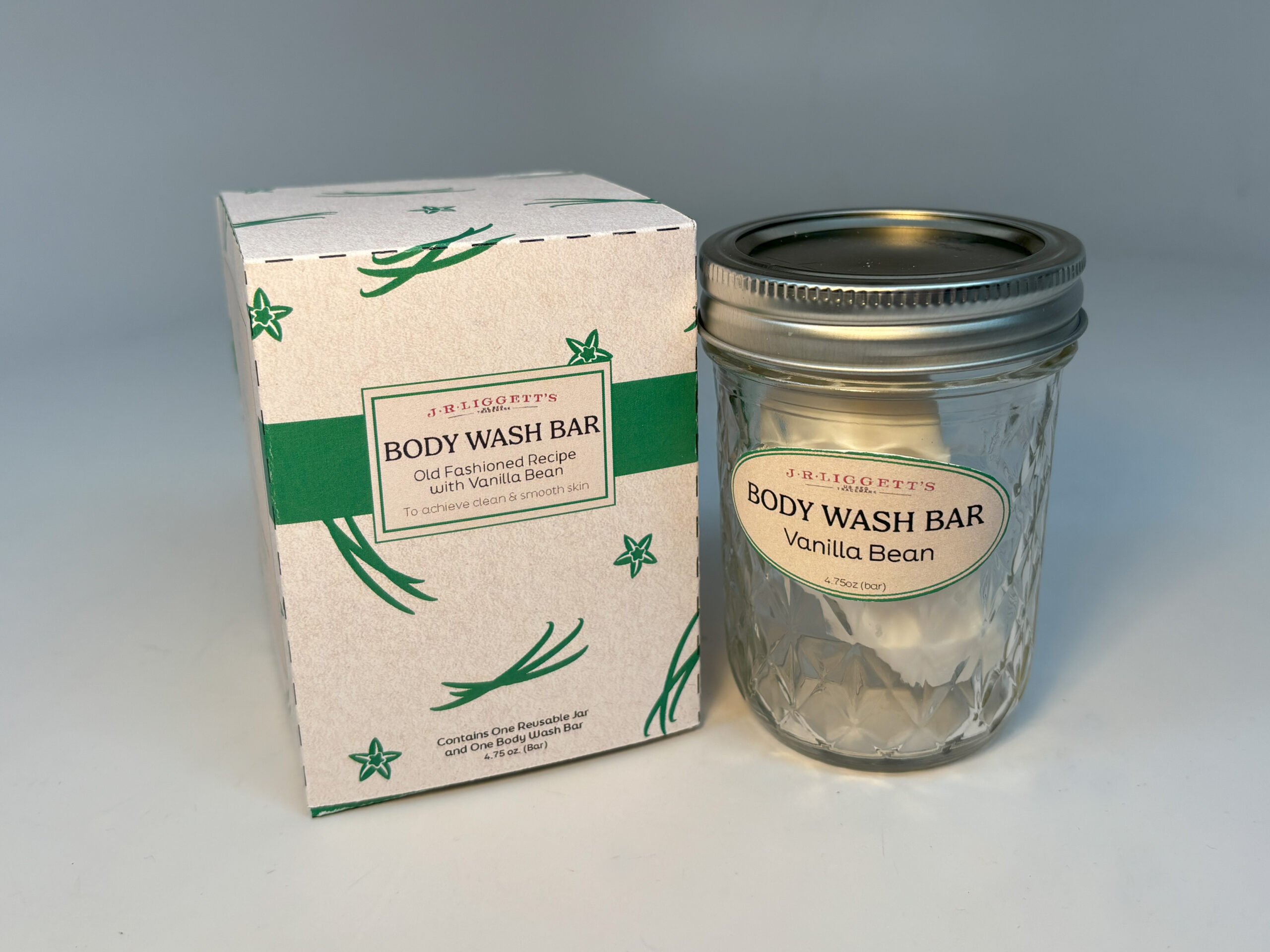
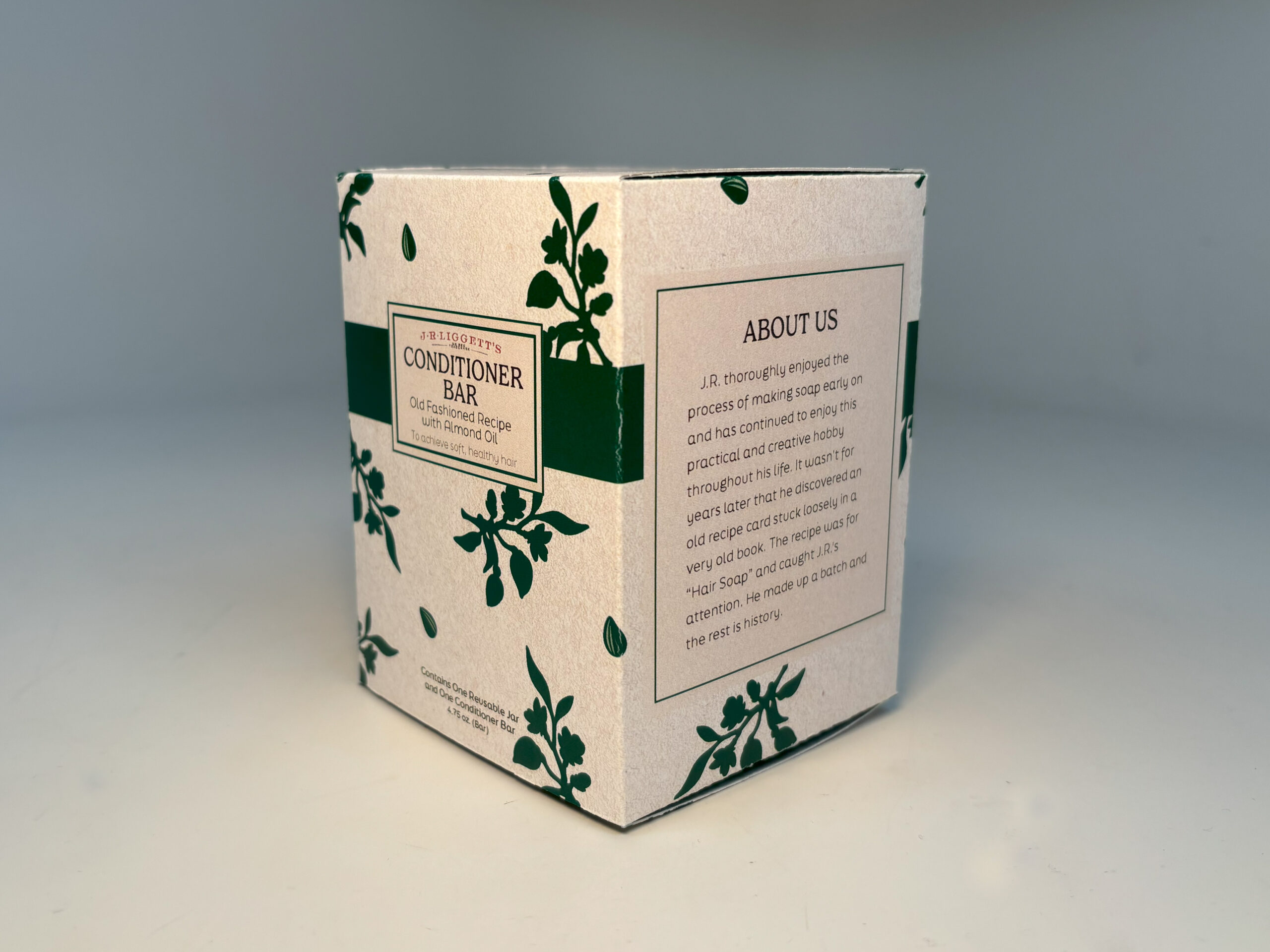
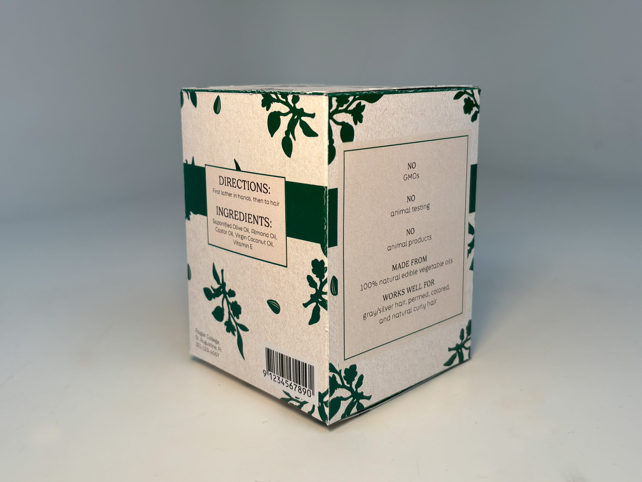
J.R. Liggett’s brand is renowned for its natural shampoo bars, crafted with high-quality oils and eco-conscious packaging. The new product line refreshes the design while staying true to the brand’s natural, minimalist ethos, with shades of green reinforcing its commitment to sustainability. The packaging minimizes paper use, with a paper insert inside the box to secure the glass jar. The reusable glass jar offers convenience and versatility, while its ridged lid allows for easy opening, even with slippery hands. The oval-shaped soap is ergonomically designed to fit comfortably in the hand, providing a better lathering experience compared to traditional rectangular bars.
The earthy color palette, featuring green tones and sand-colored parchment,
creates an environmentally friendly aesthetic that resonates with consumers. The typography balances tradition with modernity: the main typeface reflects the “Old Fashioned Recipe” heritage, while the sleek subheading and body copy typeface
(FinalSix) adds a contemporary touch. This thoughtful design approach enhances the brand’s core message of sustainability while appealing to today’s consumers.
