City Perks Coffee Co. Rebrand
Design Challenge
Redesign the visual identity of a local business to modernize its image while reflecting its values and appeal to its target audience.
The rebranding should include a new logo, color palette, typography, and brand assets that can be applied across various touchpoints (e.g., signage, business cards, website, social media).
City Perks Coffee Co., nestled just off St. George Street in downtown St. Augustine, FL, offers a refined selection of beverages. While their drink menu may be limited, they provide an array of customizable flavors that can be seamlessly integrated into their smooth coffee and espresso offerings, allowing for a personalized experience.
Design Narrative
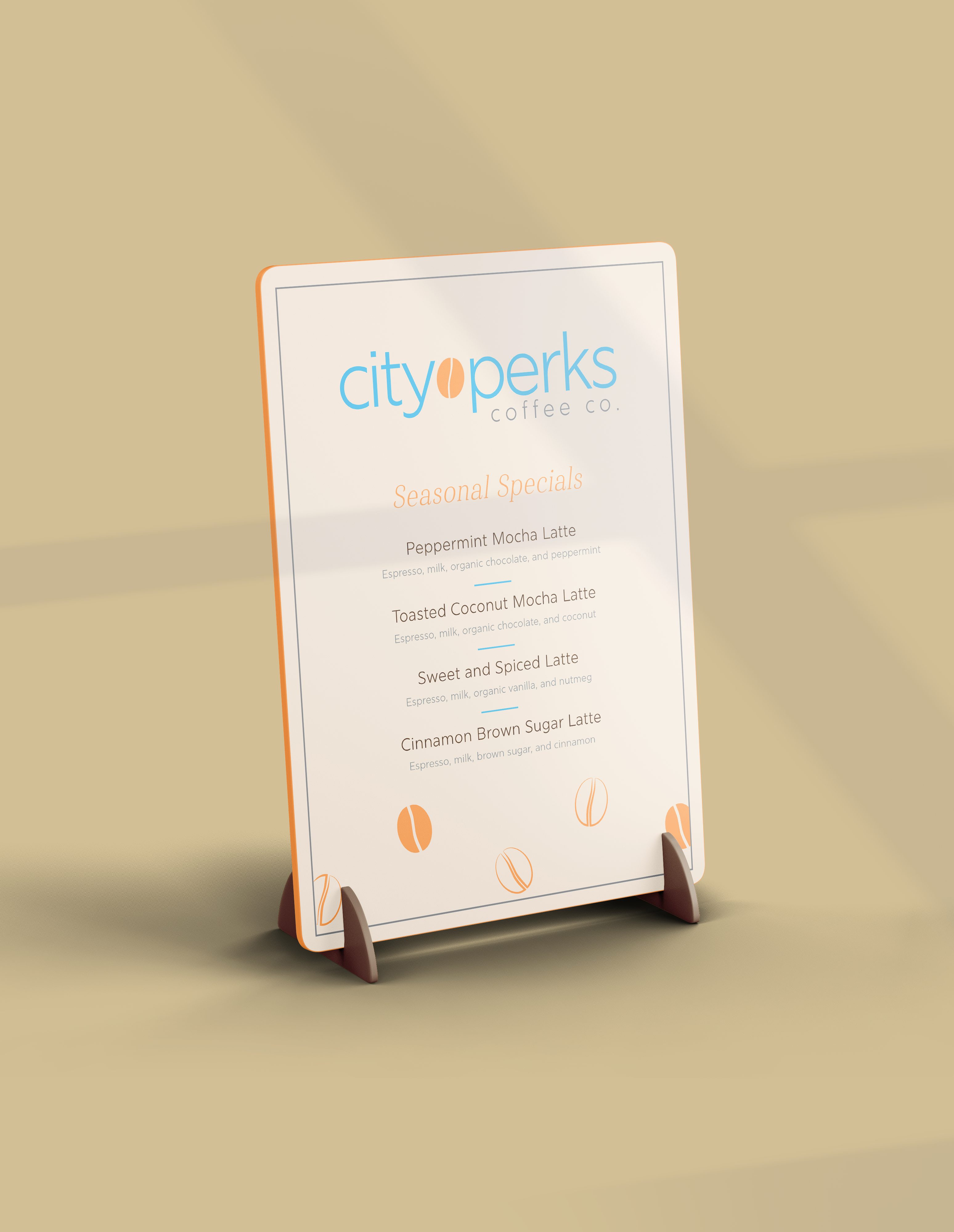
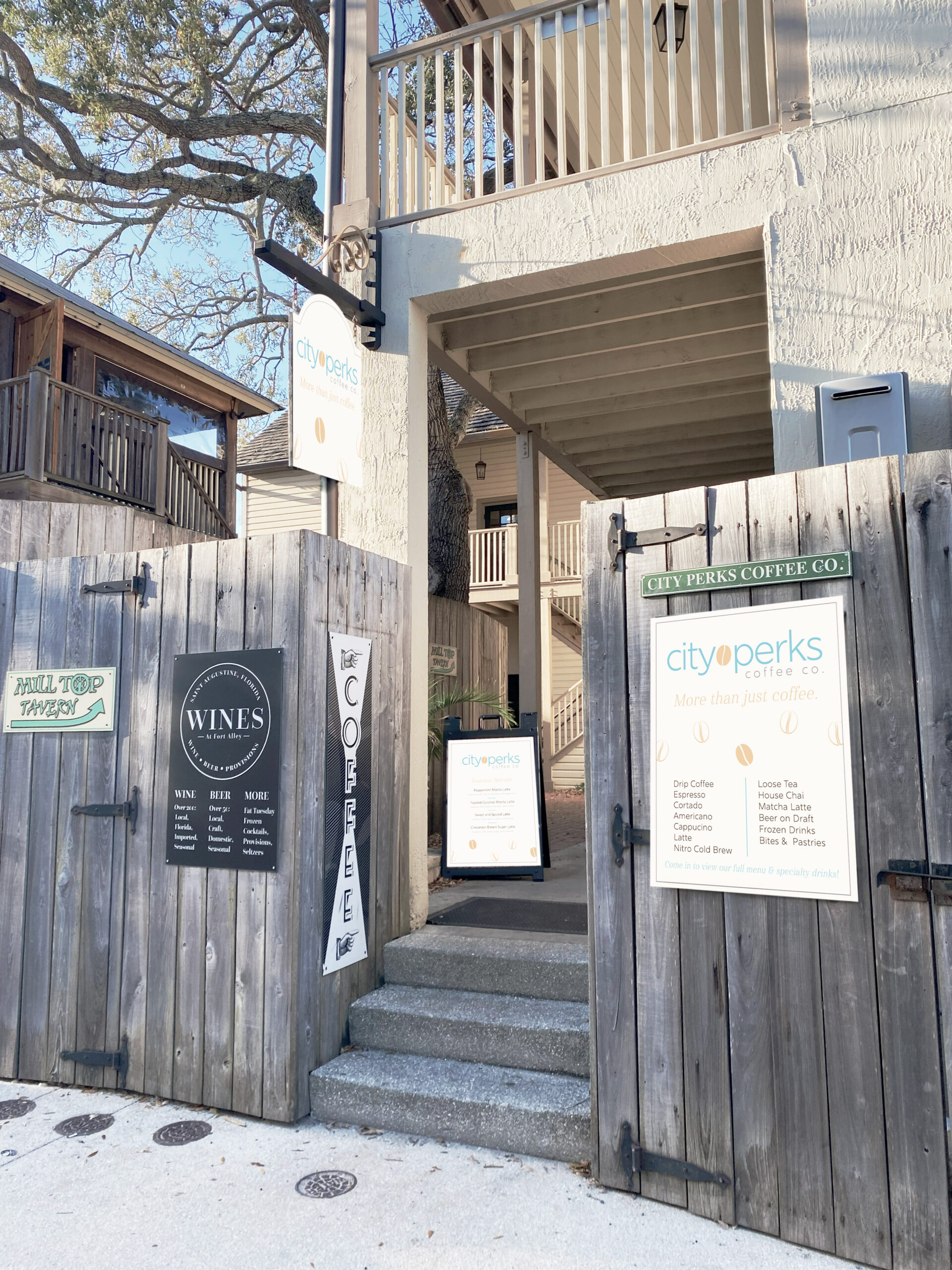
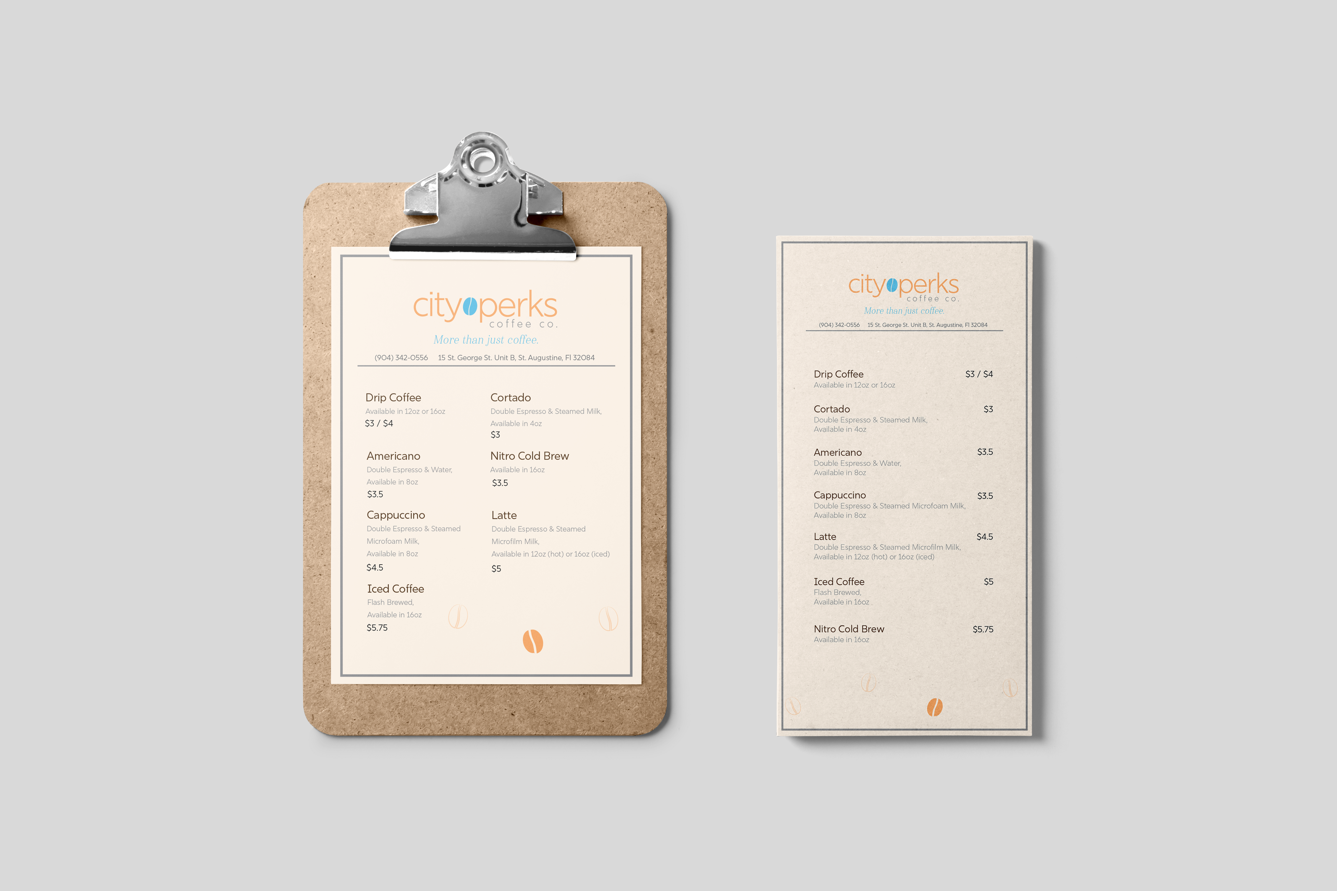
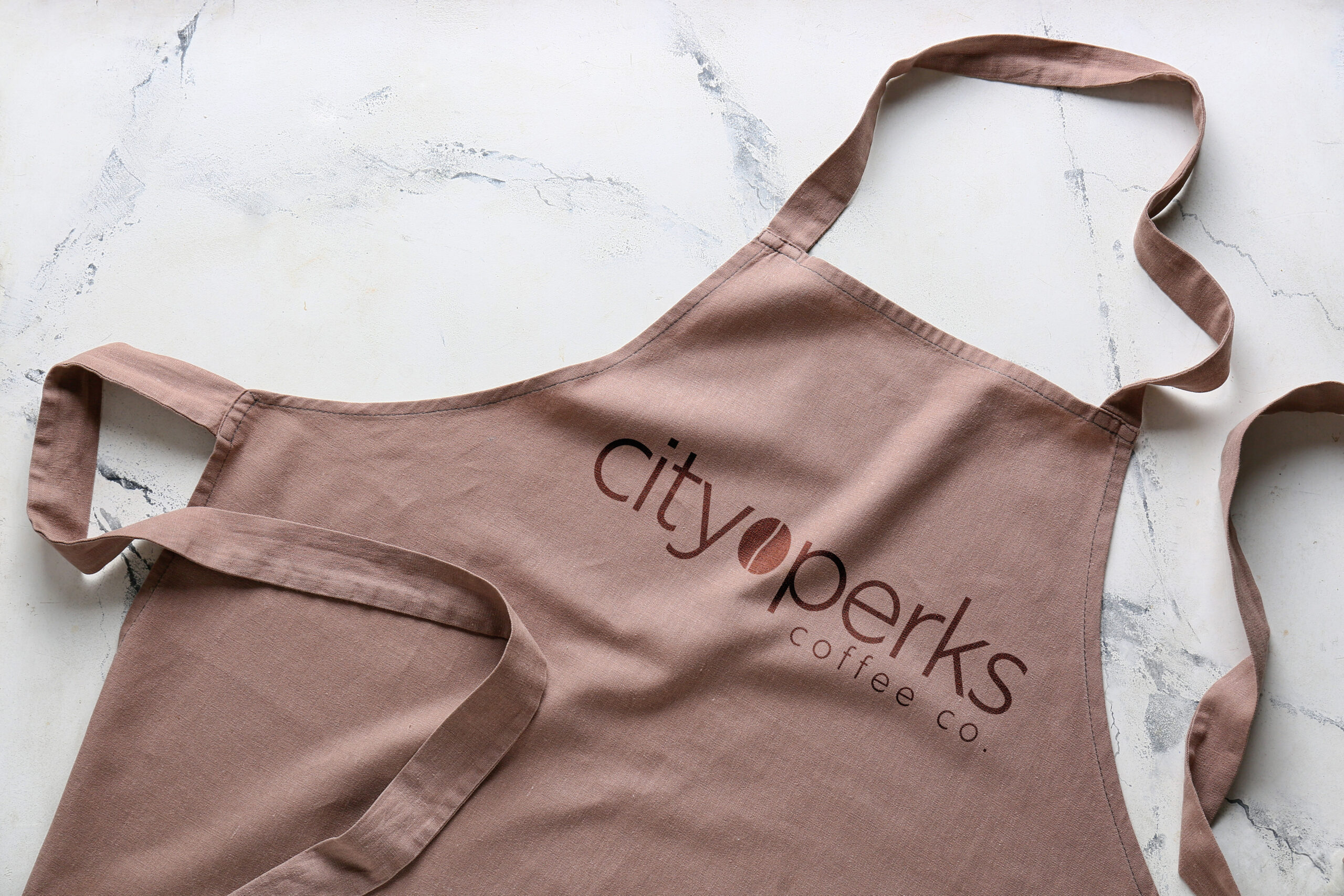
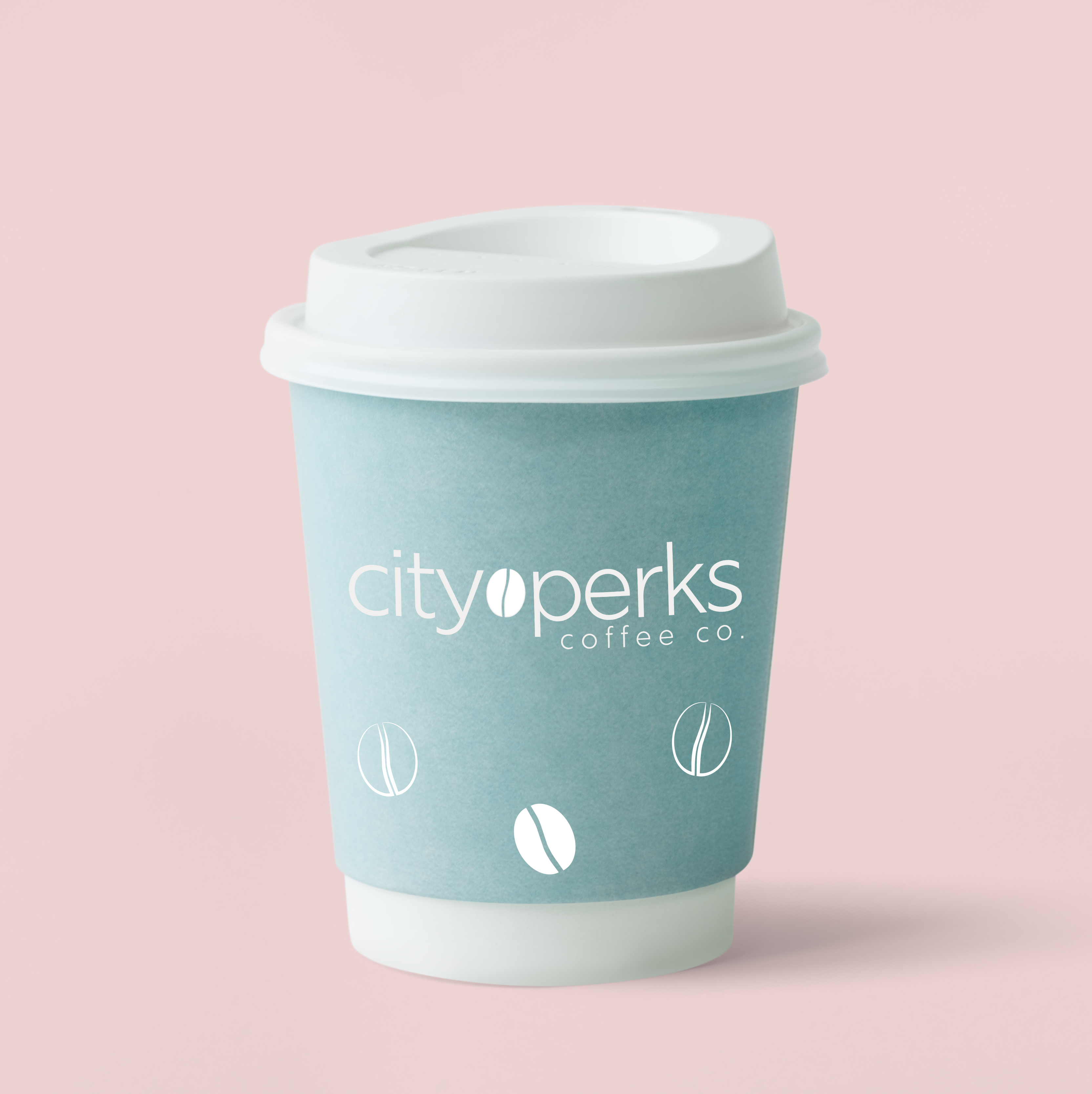
The rebranding of City Perks Coffee Co. marks a shift from its original dark and edgy aesthetic to a more open and vibrant identity. This refreshed look includes new exterior signage, redesigned specials and set menus, and updated to-go packaging. The combination of light orange, light blue, and cream creates a welcoming and modern color palette that contrasts beautifully with the darker exterior of the shop, drawing attention and inviting passersby inside. Additionally, the incorporation of coffee bean motifs at the bottom of design elements unifies the brand, reinforcing the coffeecentric nature of the business while maintaining a sense of cohesion throughout the rebranding efforts.
Outcome
The strategic design choices not only elevate the visual appeal of City Perks
Coffee Co. but also enhance its overall brand identity, creating an inviting atmosphere that reflects the shop’s commitment to quality and personalization. This rebrand positions the café as a modern, approachable destination that stays true to its roots while appealing to a broader, more diverse audience.
